Teema 12. Positive and negative example of web usability in a blog article (e.g. Jakob Nielsen usability components).
Practical task again. I like it and will analyze a Loan application form for new customers from Estonian Fintech company issuing consumer loans to private persons in Estonia: BigBank
Main principles of usability according to Jakob Nielsen (renown Danish web usability consultant) are:
Loan application forms, in a nutshell, have the purpose to collect enough verifiable information about the Applicant so the Financial institution can make reasonably well calculated decisions to give a loan to this person or not. It is calculated that in the normal economical climate, wrongly constructed application form may lead to a drop off rate of 95% of applicants and good ones lead to 90-95% of applicants finishing their applications.
Thus, this is critical for any lending business to convert as many started applications into completed ones, as the acquisition cost of marketing department is one of the top three expenses of any lender.
BigBank : https://taotlus.bigbank.ee/et
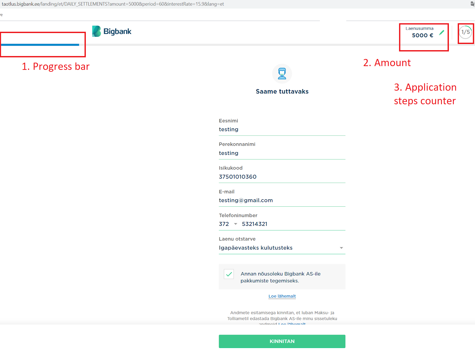
Step1.
BigBank Loan Application form for new customers is built to adhere all basic principles from Jakob Nielsen:
- Learnability is addressed by using same format on every step, clean and tidy setup, short and concise support information.
- Efficiency is addressed by having only 5 fields that applicant have to fill (normally lender requires to collect roughly 25-30 rows of user input), but making the form as 1 pager is confusing and intimidating.
- Memorability is addressed by repetitive setup of every step, same color scheme and fonts.
- Errors prevention is addressed by in-built user input checks for some field. E.g Isikukood cannot by typed in in wrong format. the application will not proceed. phone number cannot have more or less digits than Estonian mobile number have.
- Satisfaction is addressed and explained in point 2 below.
- Usefulness is addressed by points 1 and 3 below.
On the screenshot I marked 3 elements that help applicant to Navigate thru the Application process:
1. Progress bar that grows with each step, visualizing the journey and increasing the feeling of “achievement” for applicant.
2. Loan amount - most important for an applicant is the MONEY that he/she wants to receive as a result of the whole process. Having this visible at the top is like a carrot, increasing visualization for the target and leading to increased motivation to complete the process
3. Application steps counter - Applicant knows that there are only 5 steps to complete. To a normal person this shows that ahead of him not an “unknown path” but a clear and not very long process consisting of only 5 steps. not 15 or 30 page forms that you have to fill in the “normal bank”. Again, positive experience and increase of confidence in Applicant.
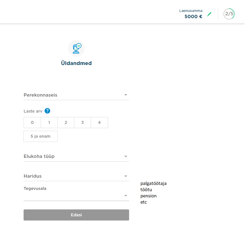
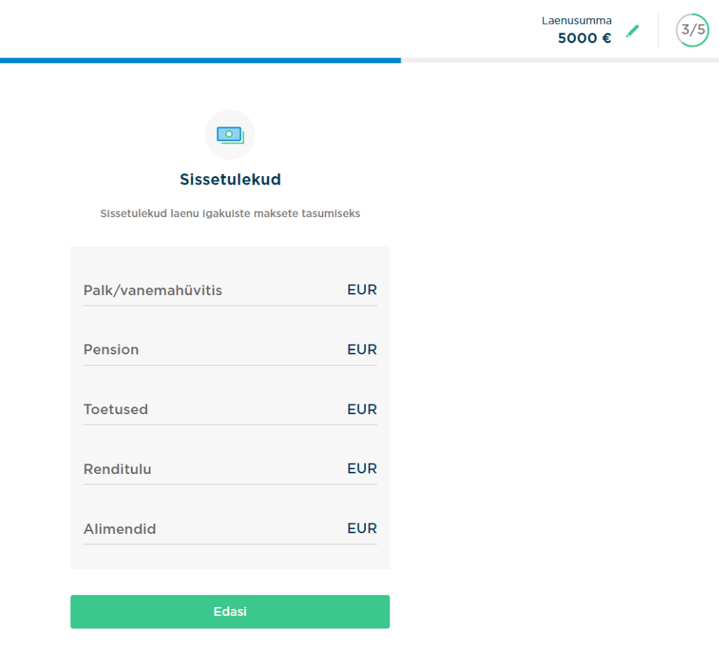
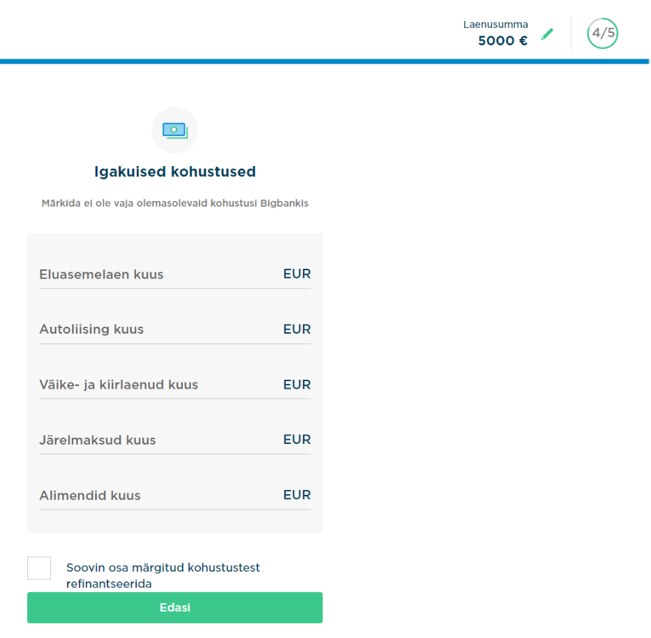
Step2, Step3, Step4 - are for data collection with a few interesting tips,
But the really interesting usability tricks are used on step 5.
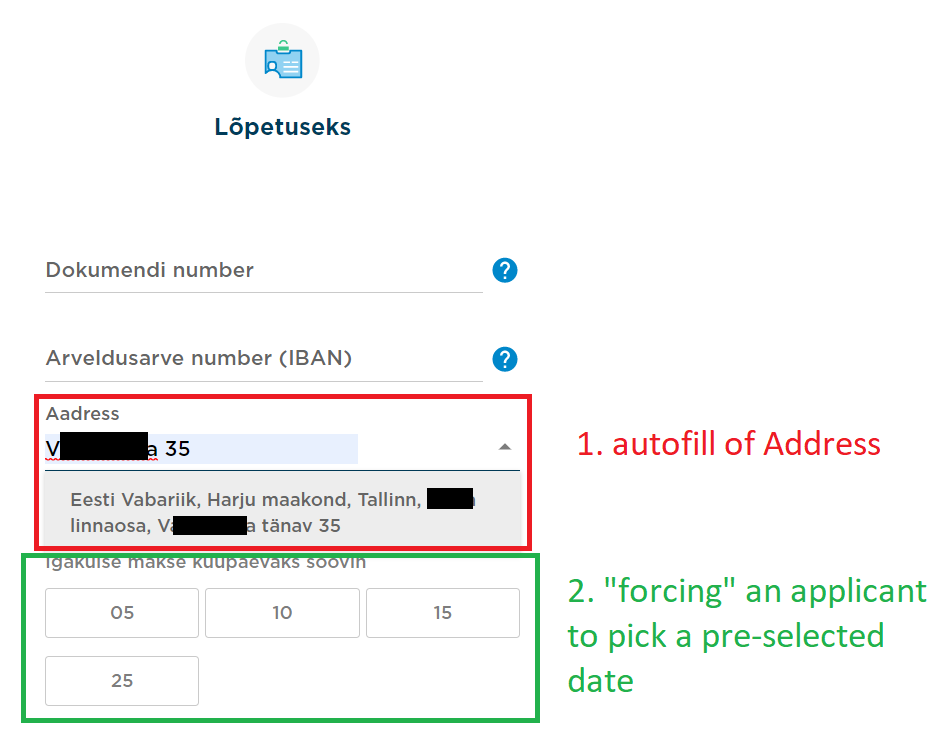
Many customers know their address, but have to remember or look for a correct postcode. Many user errors happen at this stage, which lead to unnecessary high drop off rates (customer walks from the PC/screen to look for a postcode written on envelope somewhere, gets distracted and never completes the application). Bigbank solved it by integrating with Eesti Post addresses database that suggests the correct full address with postcode, once the customer typed in part of a street name and house number.
Another interesting trick was used to gently force customer to pick only these 4 pre-selected dates as installment payment dates. These are typical dates when average person typically gets a salary. It is known in the industry that the closer the repayment date to a salary date, the higher probability that the payment will be made on time. So Bigbank makes the choice for the customers easier by giving him a pre-selected dates choice, and better for repayment statistics. win-win.
What could be done better?
1. I would address another 2 problematic fields for any user: Document Number input and long 11-digit IBAN number input.
For first problem - Document ID that is printed on Id Card or Passport and many applicants make typing mistakes in filing these numbers. Possible solution is to integrate one of many available on the market solutions using OCR technology to scan Document picture via smartphone (73% of applications come from mobile devices) or laptop camera.
For second problem the integration with online bank via SmartID would help.
so, overall i take this form as very close to be excellent at usability for a Customer taking into account all main points from Jakob Nielsen methodology, although some improvements that can be made in the future still.
Main principles of usability according to Jakob Nielsen (renown Danish web usability consultant) are:
- Learnability - How quickly does the user learn the main functions when using the object for the first time?
- Efficiency - how quickly can the user take the necessary actions once the use of the object has been learned?
- Memorability - how quickly can the user recall the necessary skills if the object has not been used for some time?
- Errors (actually fault tolerance) - How many errors does the user make when using the object, how serious are they and how difficult is it to correct them?
- Satisfaction - how pleasant is the user experience?
- Usefulness - does the object do what is needed?
Loan application forms, in a nutshell, have the purpose to collect enough verifiable information about the Applicant so the Financial institution can make reasonably well calculated decisions to give a loan to this person or not. It is calculated that in the normal economical climate, wrongly constructed application form may lead to a drop off rate of 95% of applicants and good ones lead to 90-95% of applicants finishing their applications.
Thus, this is critical for any lending business to convert as many started applications into completed ones, as the acquisition cost of marketing department is one of the top three expenses of any lender.
BigBank : https://taotlus.bigbank.ee/et
Step1.
BigBank Loan Application form for new customers is built to adhere all basic principles from Jakob Nielsen:
- Learnability is addressed by using same format on every step, clean and tidy setup, short and concise support information.
- Efficiency is addressed by having only 5 fields that applicant have to fill (normally lender requires to collect roughly 25-30 rows of user input), but making the form as 1 pager is confusing and intimidating.
- Memorability is addressed by repetitive setup of every step, same color scheme and fonts.
- Errors prevention is addressed by in-built user input checks for some field. E.g Isikukood cannot by typed in in wrong format. the application will not proceed. phone number cannot have more or less digits than Estonian mobile number have.
- Satisfaction is addressed and explained in point 2 below.
- Usefulness is addressed by points 1 and 3 below.
On the screenshot I marked 3 elements that help applicant to Navigate thru the Application process:
1. Progress bar that grows with each step, visualizing the journey and increasing the feeling of “achievement” for applicant.
2. Loan amount - most important for an applicant is the MONEY that he/she wants to receive as a result of the whole process. Having this visible at the top is like a carrot, increasing visualization for the target and leading to increased motivation to complete the process
3. Application steps counter - Applicant knows that there are only 5 steps to complete. To a normal person this shows that ahead of him not an “unknown path” but a clear and not very long process consisting of only 5 steps. not 15 or 30 page forms that you have to fill in the “normal bank”. Again, positive experience and increase of confidence in Applicant.
Step2, Step3, Step4 - are for data collection with a few interesting tips,
But the really interesting usability tricks are used on step 5.
Another interesting trick was used to gently force customer to pick only these 4 pre-selected dates as installment payment dates. These are typical dates when average person typically gets a salary. It is known in the industry that the closer the repayment date to a salary date, the higher probability that the payment will be made on time. So Bigbank makes the choice for the customers easier by giving him a pre-selected dates choice, and better for repayment statistics. win-win.
What could be done better?
1. I would address another 2 problematic fields for any user: Document Number input and long 11-digit IBAN number input.
For first problem - Document ID that is printed on Id Card or Passport and many applicants make typing mistakes in filing these numbers. Possible solution is to integrate one of many available on the market solutions using OCR technology to scan Document picture via smartphone (73% of applications come from mobile devices) or laptop camera.
For second problem the integration with online bank via SmartID would help.
so, overall i take this form as very close to be excellent at usability for a Customer taking into account all main points from Jakob Nielsen methodology, although some improvements that can be made in the future still.

Comments
Post a Comment